Understanding when to use padding Vs. margin in CSS
— 7 minutes to read
In the world of CSS, getting the spacing right is crucial for creating visually pleasing and well-structured layouts. Two fundamental properties for managing space are padding and margin.
However, determining when to use each can be a bit confusing! In this post, we'll explore the differences between padding and margin, along with real-world examples to help you make informed decisions.
The Box Model: A Quick Primer
Before we dive into the details, let's quickly revisit the box model concept.
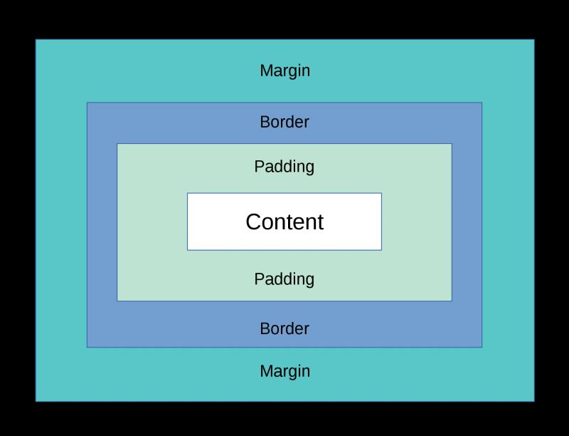
Each HTML element is essentially a rectangular box that encompasses content, padding, border, and margin. Understanding these components is vital for controlling spacing and layout.
- Content: The actual content of the element, such as text, images, or other media.
- Padding: The space between the content and the inner edges of the element.
- Border: The line that surrounds the padding and content, demarcating the element's boundaries.
- Margin: The space around the element, pushing other elements away.
With this in mind, let's delve into the specifics of when to use padding and margin in your CSS.
Padding: Space Inside the Box
Padding is for internal spacing.
Padding is the space between the content (children) of an element and its edges. It creates an internal buffer within the element, pushing the content away from the element's boundaries. Think of it as 'the space inside a box that stops children from hitting its edges'.
It's worth noting that padding doesn't collapse. Two sibling elements each with their own padding and no border will give the illusion of double the amount of visual space because their paddings will stack up against each other (they both have 'internal' space).
Let's consider an example of a simple card component:
.card {
  /* Apply equal padding on all sides */
  padding: 20px;
}
In this case, the padding property adds 20 pixels of space within the .card element. You can also define different values for each side:
.card {
  /* Apply 10px top and bottom, 20px left and right */
  padding: 10px 20px;
}
Padding doesn't need to be defined in pixels. In fact, it's often defined in rem at a component or layout level, and occasionally in em on elements like buttons so that the button padding can scale with the button's font size.
I find it helpful to think of padding something that only belongs on boxes — on HTML elements that can have child block elements. It rarely makes sense to place padding on a paragraph, for example, because it only ever contains text and inline elements (like anchors or italics). It is not a 'box' and has no concept of 'internal spacing'.
Margin: Space Outside
Margin is for external spacing.
Margin is the space around an element, pushing other elements away. It defines the gap between the element and its neighbouring elements. Use margin to create space between different elements on the page.
Note that margin collapses by default. This means that when you have two sibling elements each with a margin between them, these margins will overlap each other and occupy the same space. Whichever margin is the largest will 'win' visually.
Suppose you have a list of items that you want to space out evenly:
.item {
  /* Add margin at the bottom of each item */
  margin-bottom: 1em;
}
This adds a 1em gap between each .item element, providing a clear visual separation.
Personally, I prefer to use margin-top in most cases.
Let's say you want to add space above all items except the first one, and you want the spacing to be relative to the font size. You can achieve this by using margin-top with em units:
.item:not(:first-child) {
  /* Add proportional margin top on all except the first item */
  margin-top: 0.5em;
}
In this example, the :not(:first-child) selector targets all .item elements except the first one, and applies a margin of 0.5em on top, creating a relative spacing that adapts to the font size.
This is a very common approach for prose parts of a website, such as a blog article, because it creates a nice vertical rhythm, with proportional spacing above headings and paragraphs.
Here is a technique colloquially known as Heydon Pickering's 'lobotomised owl' to add that vertical spacing (using margin) without having to add a class to every child element:
.article > * + * {
  /* Add margin top on all direct children except the first child */
  margin-top: 0.5em;
}
You can read more about it on Every Layout. Just be aware that using this approach significantly increases the CSS specificity of that selector, meaning it could be hard to override if you want one element to have a different margin-top later on.
Using the gap Property
For modern layout designs, you might consider using the gap property, which specifies the gap between grid and flex items.
Unlike traditional margins, the gap property creates space between elements without collapsing margins. It's especially useful when dealing with flexbox or grid layouts.
.container {
  display: grid;
  grid-template-columns: repeat(3, 1fr);
  gap: 1.5rem; /* Apply a 1.5rem (24px) gap between grid items */
}
Note, if you also added margin to one of this grid's children, it would create additional space on top of the gap that is already there.
The most common use-case for using margin on grid/flex child elements when that grid is already using gap is when you want to 'push' a child to a specific place using margin: auto. For example, if all cards in a grid need the button vertically aligned at the bottom, and content aligned to the top, you might do this:
.card-grid {
  display: grid;
  grid-template-columns: repeat(3, 1fr);
  gap: 2rem; /* Apply a 2rem (32px) gap between grid items */
}

.card-grid__card {
  display: flex;
  flex-direction: column;
  gap: 1.5rem; /* Apply a 1.5rem (24px) gap between card children */
}

.card-grid__btn {
  margin-top: auto; /* Push all content up and button down */
}
Now, no matter if some cards have longer titles or paragraphs inside, the buttons will always be aligned at the bottom of every card.
Knowing When to Choose
Here's a simple rule of thumb:
- Use Padding: When you want to control the space inside an element, such as adjusting the spacing between a box and the text or other content inside it.
- Use Margin: When you want to create space between elements, ensuring proper spacing and layout separation.
Combining Padding, Margin and Gap
In some cases, you might use both properties together to achieve the desired layout.
Let's continue with the card grid example given above, and see how we can use all three properties to create a harmonious layout:
/* Example: Image Cards with Padding, Margin, and Gap in a Grid */

.card-grid {
  display: grid;
  grid-template-columns: repeat(auto-fit, minmax(17rem,1fr));
  gap: 30px; /* Apply gap between cards */
}

.card {
  padding: 1rem; /* Add padding around the content */
  background-color: #f5f5f5;
  border-radius: 10px; /* Add rounded corners for style */
  box-shadow: 0 2px 4px rgba(0, 0, 0, 0.1); /* Add subtle shadow */
}

.card img {
  margin-bottom: 15px; /* Space between image and text */
}

.card p {
  margin: 0; /* Reset margin for the paragraph */
}
In this example,
- the gap on the grid creates space between each card
- the padding adds space within each card so its children (the image and paragraph) can't touch its edges
- the margin-bottom on the image creates space between the children.
- the margin reset on the paragraph makes sure no additional unwanted space is created inside the card
Conclusion
Understanding the difference between padding and margin is essential for creating well-proportioned and visually appealing layouts.
Remember that padding affects the inner space of an element, while margin controls the space around an element.
By grasping these distinctions and using examples like those discussed above, you'll be better equipped to make informed CSS choices and achieve balanced and organised designs in your projects.