Recommended Frontend Mentor challenge order for junior devs (2023)
Updated on — 7 minutes to read
Here I suggest an order of newbie Frontend Mentor challenges that you might like to follow if you are new to the platform or front end development in general…
My list for Beginners
Although I'm suggesting an order here, please remember it's not an exact science.
I'll try to explain why I suggest each challenge in this (rough) order. And hopefully, you'll see that I'm trying to help you build skills progressively.
As a self-taught developer, I have first-hand experience of feeling overwhelmed by challenges I couldn't do (this still happens regularly by the way!). I hope this list helps you avoid feeling overwhelmed, even if you choose to skip challenges or take them in a different order.
A good rule of thumb is to attempt challenges where you think you can comfortably do about 80% but will need to look up the last 20%. That's what this list intends to do.
1. QR Code Card
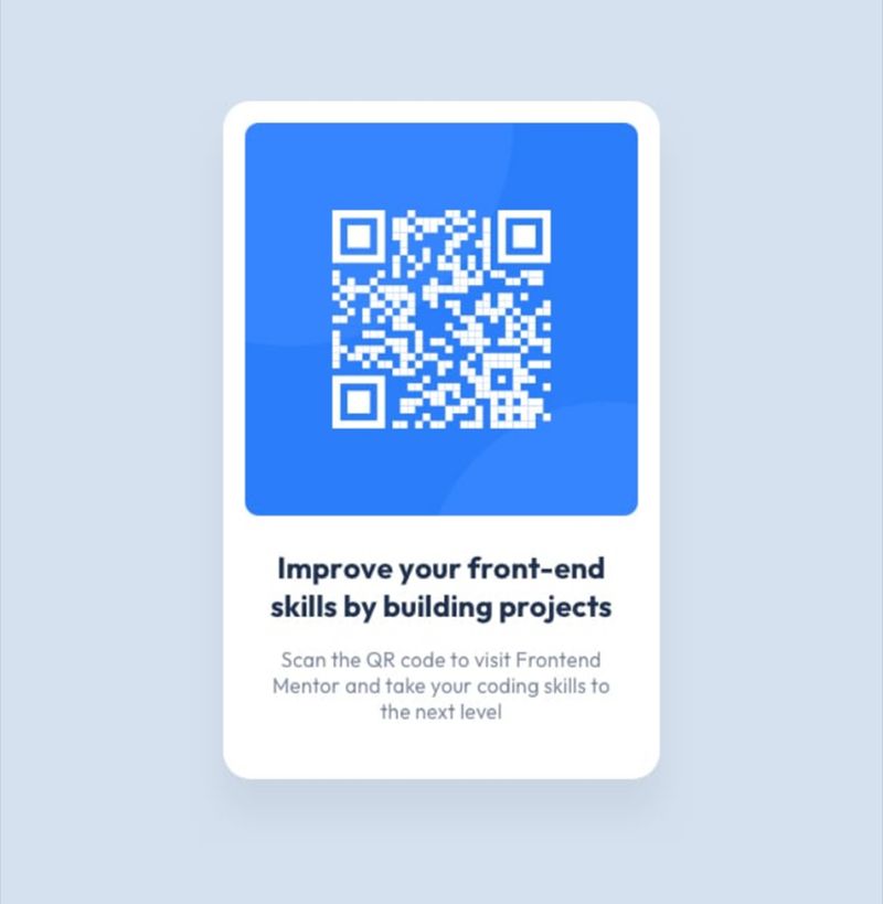
It looks super simple, but gives you a chance to practice:
- how to use the style guide
- landmarks and semantic HTML
- how to link Google fonts
- using a modern CSS reset
- how to centre a component in the viewport with flex/grid
- writing good image alt descriptions
2. Product preview card or Order summary component

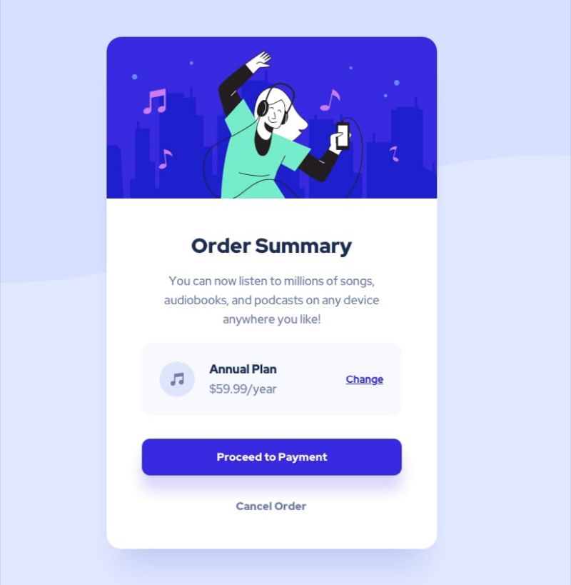
These will build on the above but with an extra focus on:
- image sizing with object-fit
- buttons vs anchors
- flexbox (and possibly CSS grid)
- heading order
- mobile-first styling
- responsive images using the picture element
(in the product preview card) - how to add extra info for screen reader users
(in the product preview card)
💡 You may like to look at my post about planning out your HTML at this point!
3. Stats preview card

Now you'll practice more:
- CSS grid and Flexbox
- list styling (and how to keep them accessible)
- blend modes on images
4. The 3-column preview card
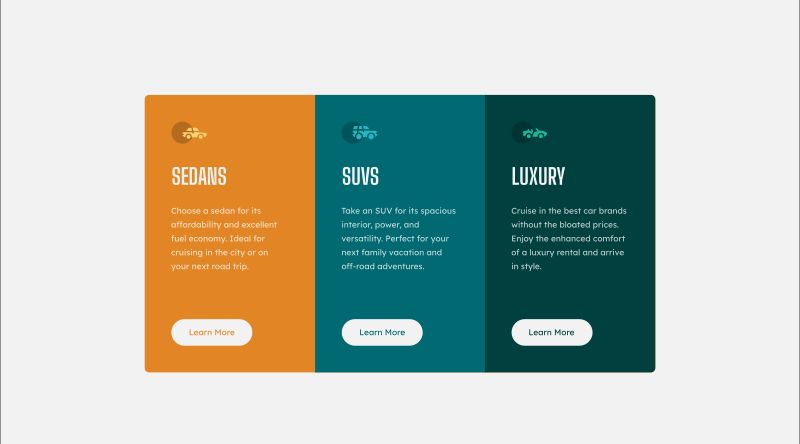
This builds on the previous skills:
- CSS Grid and/or Flexbox
- headings and semantic HTML
- decorative images
- hover and focus-visible styles
- more practice with mobile-first responsiveness
5. Single price grid or Huddle landing page


Whether or not you've used it before, this is time to use CSS grid!
You'll also practice:
- landmarks and semantic HTML structure
- SVG hover styles
(in the Huddle landing page) - Heading order
(in the Single price grid component)
⚠️ Note, the single price grid component design has particularly poor colour contrast, making it inaccessible. Feel free to adjust the colours if you wish!
6. The 4 card feature and Social Proof section


These are more complex CSS grid challenges.
I recommend trying out grid-template areas if you've not done so already, and plan out your grid on paper if it helps.
You'll also gain more experience with:
- using alignment methods like directional auto or negative margins, text alignment, transforms, flex properties or CSS grid properties
- max-width in ch or rem
- pseudo-elements or borders
- visually hidden headings
(in the social proof section)
Honestly, doing both of these challenges is likely very beneficial!
7. Ping single column or Base Apparel coming soon page


It's JavaScript time! If you haven't studied any JS at all yet, pause here and try to learn some basics.
It's also worth reading MDN's excellent docs or tutorials on HTML form validation, as that's what these challenges focus on.
You'll also have the opportunity to learn:
- more flex/grid
- accessible form HTML markup
- how to programmatically link errors and inputs
- aria-live attributes
8. Intro with sign up form

You will need lots of form validation practice. This is a huge part of a front end developer's job, so get familiar with forms as much as you can!
Again, this isn't the most accessible design because (a) it's missing visible form labels and (b) has poor colour contrast. Feel free to adjust it to make it properly accessible, or ignore those two issues and focus all your energy on emulating the design and validating that form in an accessible way.
You'll also be able to stretch skills like:
- semantically meaningful HTML (as always)
- lean JavaScript (it should be as minimal as possible)
- separation of styling and script concerns
- accessible error announcement
- aria-describedby attributes
- positioning and styling based on dynamic errors
- background images
- more complex CSS selectors
9. Results Summary Component

A lovely little challenge that introduces a separate data file, like those you'll work with day-to-day in front end work.
This challenge adds opportunities to learn:
- how to power HTML content from data
- custom properties and/or colour modifiers in CSS
- some challenging pre-planning to get the HTML structure right
10. Interactive rating card

I love this challenge but it's amazing how few people plan their HTML correctly on this one.
Hint: It's a form! Look up which form elements would be most appropriate for those circles. Another hint: They're not buttons! 😉
Here you'll learn:
- more about working with form data
- submit events
- announcing content changes to the accessibility API
- accessibly styling previously unused form elements (This can be a bit tricky! ModernCSS.dev has some great posts that should help)
11. NFT preview card

This will be a real test of what you've learnt so far, especially in terms of meaningful HTML.
It also is a great opportunity to learn more about:
- pseudo-elements
- fun hover styles
- accessible naming practices for interactive elements
12. Workit landing page, Equalizer landing page, or Pod request access landing page
If you have PRO membership and want to practice more CSS and HTML in a bigger project, have a go at one or more of these landing pages.


These are great portfolio pieces and will help weave everything you've learned together. Think of it as a chance to stretch yourself on a bigger challenge, testing and embedding those skills!
13. News homepage

This is another great one for CSS grid and testing out your awareness of meaningful HTML structure. It needs careful planning (mobile first), should include visually hidden headings, and has the bonus of a mobile menu toggle.
⚠️ Make sure you get confident with how to code a 'disclosure pattern' (like a mobile menu toggle) — It's something you will need to build countless times in your career and it is easy to make accessible if you look up how!
14. Advice generator app

As well as building on existing skills, this lets you practice fetching data from an API. That's super important in front end development!
You'll also need to use:
- the aria-live attribute
- well-structured HTML
- accessible naming
15. Newsletter sign up form with success message

This one brings together some form validation and data use, styling challenges and content change announcements for assistive tech. A lovely little challenge!
Next Steps (months later)
In case you haven't noticed, the list has moved on to junior-level challenges! These are more complex, in terms of layout, interactivity or accessibility. Choose any junior challenge that looks like it will stretch you in the specific area you want to practice most. Hopefully, you'll be able to identify a good one for yourself from now.
If I could recommend any next step, beyond even these, it would be to attempt something with a theme toggle (or even add one to a challenge you've already done!)
Good luck, and have fun!