How to translate a design into HTML — Part 1: Product Preview Card
Updated on — 23 minutes to read
Part 1 of a series of posts teaching you how to break down a static design into the most suitable HTML structure.
Series Intro
I have been mentoring junior developers for years. In that time, one issue comes up again and again. Courses for aspiring developers teach almost nothing about the importance of HTML structure!
So it's not your fault if you struggle with this! Bootcamps and tutorials skip over HTML like it's unimportant. But this process of translating designs into appropriate and meaningful HTML is the most important skill of all for developers who want to build accessibly.
HTML is like the foundations of a building. If you get that wrong, issues are inevitable.
That's why I'm starting this series of posts. Each post will go step-by-step through the content of a Frontend Mentor design and write the HTML. I'm not saying my way is the only way to do a challenge. The goal is to help you build up your own 'semantic senses'. We'll learn the thinking process behind choosing elements together. Over time I hope you'll find it easier to write appropriate HTML, even if it differs a bit from mine.
I hope you find this helpful!
The design
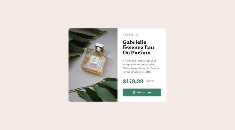
This post is going to look at a common design pattern: The Product Preview Card Component Challenge.

It's rare we should ever need to duplicate HTML, meaning it will be the same for all screen sizes.For the rest of this post, I'll be annotating the mobile/small screen design in images. Just be aware that the notes apply everywhere, because there would only be ONE set of HTML.
Also note that in card examples, I'll be adding BEM-style classes (Read 'BEM 101' on CSS Tricks if you're curious). You don't have to do this and I don't always do this. But it should make it easier for you to see at a glance which bit of content each element relates to.
Landmarks
Landmarks are elements are: header, main, aside and footer. All page content should sit within landmarks.
What about Article and Section?
You may also be aware of article and section, which are often referred to as "landmarks". But they are a bit different, and not page-level landmarks in my opinion.
- These almost always sit inside the
mainlandmark - For the accessibility API to recognise them as landmarks, they need to have an accessible name. That means having a heading and using
aria-labelledbyor usingaria-label. Without that, they are treated just likedivs.
Section in particular, is often misunderstood! I'll post about these elements another time. For now, I prefer to exclude them when thinking about the 'top level' landmarks on a page.
This is a single component challenge, so we only need a main landmark to wrap the design. You may also need a footer landmark below this for attribution back to the FrontEnd Mentor site. (Attribution is not shown on the design above, but the content is provided when you download the starter files.)
👉🏼 General rule: Every webpage should at least have a main.
The Card
This is a chunk of related content. As such, it would be completely valid to make the card a section or article if you wanted to. But, I think that's unnecessary / optional for this specific card component.
Let's think about how this component would be used on a real site... I envisage a scenario where there would be loads of these cards on one page. In fact, that's very likely for this kind of content.
Cards like this are often displayed in a grid or row of several. The HTML for that is usually a list, so that screen readers can announce how many product cards there are. For example:
<ul class="product-card-grid">
  <li class="product-card-grid__item">
    <!-- Product Card goes here -->
  </li>
  <li class="product-card-grid__item">
    <!-- Product Card goes here -->
  </li>
  <li class="product-card-grid__item">
    <!-- Product Card goes here -->
  </li>
  <li class="product-card-grid__item">
    <!-- Product Card goes here -->
  </li>
</ul>
Personally, I think that using a labelled article (or section) inside each of these list items creates a load of extra 'semantic noise' and seems unnecessary. The headings inside each card already give the content plenty of meaningful structure.
Hence, I'll make the component a plain old div!
<div class="c-product-card">
  <!-- Content here -->
</div>
When is a section or article better?
This needs it's own blog post really, but in short: Only use a labelled section or article for a card like this if it has multiple controls within it, and the card may repeat multiple times on a page.
For example, if this product card had
When is a section or article better?
This needs it's own blog post really, but in short: Only use a labelled section or article for a card like this if it has multiple controls within it, and the card may repeat multiple times on a page.
For example, if this product card had
If you'd still rather use article or section, the HTML would need to look like this, with an accessible name for that section to be recognised in the accessibility tree.
<section class="c-product-card"
  aria-labelledby="cardTitle-087633-282652-2267757862-67262">
  <!-- Content here -->
</section>Inside the card we need to set up two containers, one for the image part and one for the text part. Here's where my HTML markup ends up so far:
<main>
  <!-- Card could be a labelled article/section if you prefer -->
  <div class="c-product-card">
    <div class="c-product-card__img-half"></div>
    <div class="c-product-card__text-half"></div>
  </div>
</main>
Product Image
You can see in the design and starter files, this component has different images for small and large screens.


🤔 You may be tempted to use background images here, but that's a bad idea because:
- This is a meaningful image. Product images should always have a proper description in the alt attribute.
- Background images are usually less performant. They involve a call to the server for the CSS, then another call to fetch the image.
- Background images create a worse user experience, because the user's device will download all of them, even if some are hidden (i.e. irrelevant for their screen size).
- You'll have to write extra CSS to show/hide each image.
🤔 Or, you may consider using two image elements, with classes on each to show/hide them in a CSS media query. That's a bad idea too.
- It's bad for performance. Much like background images, the browser will download both images no matter what size screen you are using to view the site.
- You'll have to write extra CSS to show/hide each image.
🤔 So what is the solution...?
This is the perfect time to use the <picture> element!
Check out the picture element on MDN if you're not already familiar with it. It is one of my favourite elements and is great for performance. (Yes, I have favourite elements!) Only the image you need for your screen size/resolution gets downloaded. And this happens all through pure HTML. So simple.
Notes on the picture element
Just as we should style mobile first, I recommend using the picture element 'mobile first' too.
In other words, put the image for the smallest screen the src in the img element. Then put images for larger screens in the srcset of the source element(s).
Also note, if you ever need more than one source element inside a picture, they will need to be in the correct order. For example:
<picture>
    <!-- largest image -->
    <source srcset="/media/images/decorative-image-3.jpg"
      media="(min-width: 60rem)">
    <!-- medium image -->
    <source srcset="/media/images/decorative-image-2.jpg"
      media="(min-width: 40rem)">
    <!-- smallest image (default) -->
    <img src="/media/images/decorative-image-1.jpg" alt="">
</picture>
So now our HTML should look like something like this (... denotes where content needs adding):
<main>
  <div class="c-product-card">
    <div class="c-product-card__img-half">
      <picture>
        <source srcset="..." media="...">
        <img
          src="..."
          alt="..."
          class="c-product-card__img" />
      </picture>
    </div>
    <div class="c-product-card__text-half"></div>
  </div>
</main>Card Title

Which do you think is the main title of the card?
The word "Perfume" is in a small, pale font with uppercase text and increased letter-spacing. This is usually called "Ribbon text" in the design world.
This doesn't make sense as a heading. Headings should always go in a sequential order (I'll write more about that separately). That means this little category would need to have a higher (i.e. more important) heading level than the product name below it.
Also, imagine a load of these product cards on a page. It wouldn't make sense to have repeating categories for content structure:
h2: "Perfume"
h2: "Perfume"
h2: "Perfume"...
The product name is bigger, bolder, darker and makes much more sense as a unique heading!
Some may argue that in this case it would be better to keep them both as headings. Or place them together in one heading, using spans to style each line. Or change the DOM order so screen readers announce "Perfume" after the heading.
None of that is necessary. The ribbon text is fine as a paragraph and the product name a heading.
What heading level to choose?
If this was a real project, we would have more context for this design. We would know the surrounding page content and have a better idea of where this component sits within the content hierarchy. That would guide what heading level we choose.
But we don't have that in this case. All we have is a basic design. My default is to opt for the highest heading level you think this component could have.
There's always going to be a h1 on the page. So I'd give this card a h2 for now. I can always change it to a h3 later if needed.
See related post: Why heading order matters in HTML.
Here's where the markup is so far:
<main>
  <div class="c-product-card">
    <div class="c-product-card__img-half">
      <picture>...</picture>
    </div>
    <div class="c-product-card__text-half">
      <p class="c-product-card__ribbon ribbon-text">Perfume</p>
      <h2 class="c-product-card__title">Gabrielle Essencce Eau De Parfum</h2>
    </div>
  </div>
</main>It may bother you that this ribbon text — which does look sort of 'titley' — is only a paragraph. There is one more thing you could do to make it stand out when looking at the code... add a hgroup wrapper:
<div class="c-product-card__text-half">
  <hgroup class="c-product-card__title-group">
    <p class="c-product-card__ribbon ribbon-text">Perfume</p>
    <h2 class="c-product-card__title">Gabrielle Essencce Eau De Parfum</h2>
  </hgroup>
</div>
⚠️ However, having a hgroup in the HTML doesn't improve the accessibility of this in any way. This is the perfect use case for the element. It's what it exists to do, and it does group the titles together nicely when reading the code.
BUT, it makes the styling more difficult. If you wanted to add consistent vertical spacing between the card's direct children with margin-top (or gap with CSS grid or flexbox), adding in that extra wrapper means you have to re-apply or repeat that styling within it.
So, it may make the code nicer to read, but it brings no benefit to end users and could make the styling more complex. With all that in mind, it's up to you if you want to use it.
Product description
This is a paragraph. No discussion needed!
Try to avoid ever placing text in divs or spans alone, as they are meaningless elements only intended for layout / styling purposes. Use a paragraph and it means screen reader users can easily read paragraph-by-paragraph if they want to (instead of line-by-line or heading-by-heading etc).
Prices
There's another little accessibility challenge in this, because the design includes two prices. One is large and bold. The other is small and has a line through it, like it's crossed out.
Think about what happens if you can't see that though... Screen reader software would read out both prices! Pretty confusing, don't you think?
The good news is there is some HTML designed for this situation. The bad news is we still have to do some extra work to make sure screen reader users know which is the old price.
Here's my initial HTML for the price:
<p class="c-product-card__prices">
  <span>$149.99</span>
  <!-- The <del> element could also be a good choice instead of <s> -->
  <s>$169.99</s>
</p>
As you can see, I've opted for the <s> element to wrap the old price. That means "strike-through", which describes the style in the design. You could use the <del> element instead, which means "deletion". That makes sense too as the old price has kind of been 'deleted'.
To make sure that screen reader users know which is the old price, you can tackle it in two ways:
- In the HTML via
spanwith a class (commonly known assr-onlyorvisually-hidden) to accessibly hide some label text . - In the CSS with a a pseudo element and the same CSS snippet to accessibly hide the label
Number 1 (the HTML-only approach) is simpler for a one-off component, but may not be so reusable. By that, I just mean you'd have to remember to add screen reader-only text in a span anywhere else you may include strike-through text. It looks like this:
<s><span class="visually-hidden">Old price: </span>$169.99</s>That's fine to use! In fact, it's my recommended approach for this component.
However, I want to let you know about an alternative technique (number 2) which can be used for all strike-through text on a site or in isolation for one component. This "CSS pseudo content technique" can be a useful tool to know about even if we don't end up using it for this component. It means that any time you use strike-through text like this the beginning and end of the strike-through will be announced by most screen readers. You can do the same for deletion (del) or highlighted (mark) text.
To implement, you'd use CSS (scss) like this:
mark,
del,
s {
  position: relative;

  &::before,
  &::after {
    // Includes the accessible visually-hidden CSS snippet:
    @extend .visually-hidden;
  }
}

s::before {
  content: ' strike-through start ';
}
s::after {
  content: ' strike-through end ';
}
For more detail on this pseudo-content technique, take a look at Adrian Roselli's 2017 article on tweaking text level styles.
With all that done, my HTML will now look like this:
<main>
  <div class="c-product-card">
    <div class="c-product-card__img-half">
      <picture>...</picture>
    </div>
    <div class="c-product-card__text-half">
      <p class="c-product-card__ribbon ribbon-text">...</p>
      <h2 class="c-product-card__title">...</h2>
      <p class="c-product-card__desc">...</p>
      <p class="c-product-card__prices">
        <span class="c-product-card__price">$149.99</span>
        <s><span class="visually-hidden">Old price: </span>$169.99</s>
      </p>
    </div>
  </div>
</main>
Note I'm using a span to wrap the current price purely for positioning and styling reasons. I would set the pricing paragraph to display flex and include flex-wrap: wrap just in case it ever needs to flow over two lines, like on a small screen with enlarged text sizing.
Call-to-action (CTA)
A common question in front end developmemt is when to use an anchor link (a href=) and when to use a button.
Clicking 'Add to cart' performs an action. It is unlikely to navigate the user anywhere, so it makes sense to use a button here.
Inside the button there is a little icon as well as the text. That text label in this button already says what clicking it will do. That means we know the icon is decorative and won't need an alt description. For decorative images, you must leave the alt intentionally blank. (It's counterintuitive, I know!)
Here's what we end up with:
<button type="button" class="c-product-card__btn btn btn--primary">
  <img src="..." alt="">
  <span>Add to cart</span>
</button>
Why wrap words in a span?
The only reason I've wrapped that text in a span is because I know it will help me position it using flexbox!
.c-product-card__btn {
  display: flex;
  flex-wrap: wrap;
  align-items: center;
  gap: 1ch; // 1ch = the width of an 0 character
}
When you're first starting out, you may leave out elements like this until you come to do the styling. That's often when I'll add extra spans or divs, as they are meaningless elements. They only exist to assist with layout/styling, and don't add any semantic meaning.
Repeating CTAs can be a problem!
If there was a page full of these product cards, you'd have a situation where there are multiple "add to cart" buttons on the page. Imagine being confronted with a button menu like this:
Add to cart
Add to cart
Add to cart
Add to cart
That could get pretty confusing to screen reader users. (And to those using screen magnification or zoom etc).
The best solution is to avoid repeating CTA labels in designs altogether! Designers and content editors are becoming more disability-aware and hopefully will stop repeating links like this in future. But we can help a bit via our code right now...
Including some screen-reader only text with the product name in the button is an easy fix for this:
<button type="button" class="c-product-card__btn btn btn--primary">
  <img src="..." alt="">
  <span>Add to cart</span>
  <span class="visually-hidden">- Gabrielle Essence Eau De Parfum</span>
</button>
Alternatively, using aria-describedby or aria-labelledby on CTAs with repeating labels can help screen reader users! This can make "Add to cart" become something like: "Add to cart - Gabrielle Essencce Eau De Parfum". Note, aria-describedby wouldn't change the accessible name for screen readers when viewing the list of all links on a page though, descriptions are only announced on focus.
I'll do a deeper dive on this technique another time. But feel free to do your own research and start using it now!
Summing up
I hope this has helped you understand my process for working out the right semantics for a design.
As we've learnt, there are occasional little 'accessibility extras' we need to add in to our HTML. But these are pretty rare! It's OK if you don't understand all of them yet. As long as you are trying to choose appropriate elements and building your accessibility awareness you are on the right track!
My end HTML looks like this (most class names and content removed):
<main>

  <!-- Product Card -->
  <div class="c-product-card">

    <!-- Image half of the card-->
    <div class="c-product-card__image-half">
      <!-- images -->
      <picture>
        <source ...>
        <img src="..." alt="...">
      </picture>
    </div>

    <!-- Text half of the card-->
    <div class="c-product-card__text-half">
      <!-- Optionally include hgroup to wrap ribbon text & heading -->
      <!-- Ribbon Text -->
      <p>...</p>
      <!-- Product name -->
      <h2>...</h2>

      <!-- Product Description -->
      <p>
        ...
      </p>

      <!-- Prices -->
      <p>
        <!-- Current Price -->
        <span>...</span>
        <!-- Old Price -->
        <s><span class="visually-hidden">Old price: </span>...</s>
      </p>

      <!-- CTA -->
      <button type="button">
        <img src="..." alt="">
        <span>...</span>
        <span class="visually-hidden">- [product name]</s>
      </button>
    </div>

  </div>
</main>
It's fine if yours looks a little different! As long as it's properly thought through.
Check it with no styles!
The true test of whether you've chosen appropriate HTML is to view your content without any styling at all. It should be super clear and understandable.
This is how my style-free HTML gets rendered:

And the final tests for whether it is accessible involve screen reader, keyboard and even voice testing if you want to. (Including testing these once this component is placed in its real context on a site!)