Why font-size must NEVER be in pixels
— 4 minutes to read
Certain font-related CSS properties will render your site completely inaccessible if their value is declared using pixels even once.
Which properties are affected?
All of these properties must never ever be declared in pixels.
font-sizeline-heightletter-spacing
Even if your style guide or design file gives you these sizes in pixels (or pts), we must translate those values into more appropriate units.
Why does it matter?
A lot more people than you may think change their base text size, usually making it larger. This can be done at an operating system level or at a browser level.
As browsers and devices make settings searchable and more user-friendly, the number of people tweaking font settings will only increase. (I once walked in on my mum holding a magnifying glass up to her computer screen because she didn't know she could change the text size! 🤭 Thankfully, those days are long behind her...)
If you've used pixels to define any of the above style properties, these will not respect the user's font size preferences!
At best this means text content becomes too small for some people to read comfortably (bring out that magnifying glass!). At worst, it means letters or lines will overlap each other, making the text totally unreadable! 😱

The good news is, if we DO use appropriate units, everything will scale beautifully for ALL users, no matter what changes they make in their settings. And these are easy changes to make!
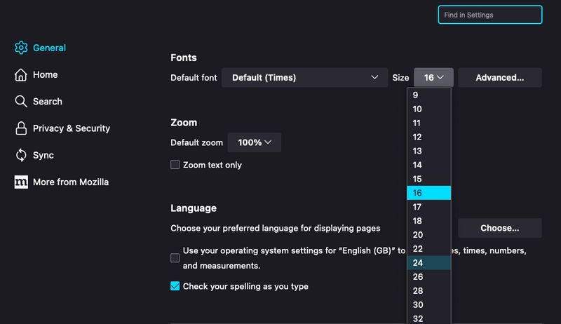
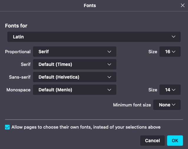
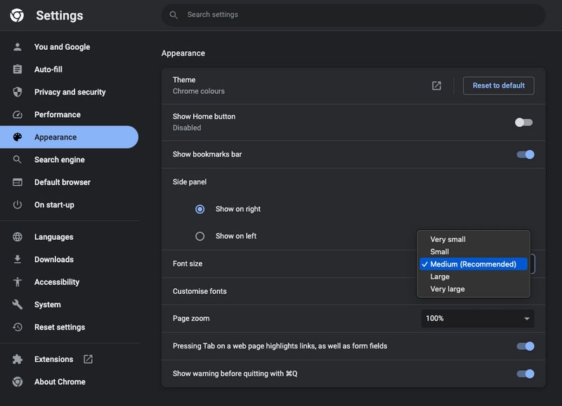
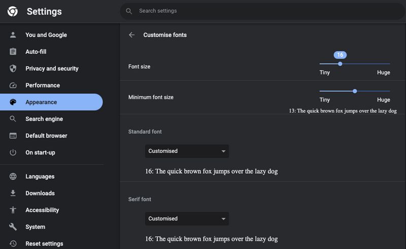
See text size changes in action!
It's worth familiarising yourself with how to change font settings in the browser so you can test your solutions more thoroughly.
Firefox font settings


Chrome font settings


There will definitely be similar settings to change text size within your operating system and on mobile devices. But I'll leave you to figure out those settings on your own. Go explore!
What units should I use?
Font-size
Generally, you won't go wrong using rem!
If your style guide of design file (e.g. Figma / Sketch / Photoshop) provides font size in pixels, you'll need to convert it to rem.
There are loads of ways to make this easier, and I've already outlined these methods in another post: Should I change the default HTML font-size to 62.5%?. Essentially you will need to divide whatever pixel value you want by 16 to get the rem equivalent for use in your CSS.
I would never recommend setting font size in em unless you have some specific use case where you need an element's font size to scale with it's parent. The only case I can think of where this may be useful is when using an icon font for symbols.
Line-height
Usually line-height is written as a unitless value, like 1.5. You may also see it written as a percentage, like 150%.
Which you choose is down to personal preference. I usually use the unitless approach, because I find it easier to read and because it's shorter, making the teeniest tiniest difference to performance.
If your design file gives you a line height value in pixels, you can calculate the unitless or % value simply by dividing that value by the font size. For example, if line-height in Figma/Sketch is 24px, and font-size is 16px: 24 / 16 = 1.5. That's your line-height! (Or 150%)
Letter-spacing
I recommend using em for letter spacing so it always scales with the text where it is used. You could also use rem or %.
These are all valid, but in this case, the em unit definitely makes the most sense to me. Letter spacing is one of those properties that you always want to scale with the font where it's used, and that is exactly what em does!
Summing up...
- NEVER use pixels or viewport units for text properties.
- Get familar with your font-size settings in various browsers, operating systems or devices. Play with the settings and see how it break some sites. Hopefully this will help you appreciate the importance of choosing responsive units!
- Test your solutions like this, resizing the viewport and using browser emulation with an enlarged font-size. Refactor where necessary!
- Font-size? Use rem
- Line-height? Keep it unitless (or use %)
- Letter-spacing? Use em (or use rem or %)