How to "make a site responsive" and use media queries well
— 7 minutes to read
A delve into what it means to "make a site responsive" and how to approach media queries when you need them.
Defining "responsive"
All websites need to be responsive. (So do all Frontend Mentor challenges, even the single component ones!)
Put simply, a responsive site or component is one that looks OK and functions well on all screen sizes from 320px wide and above without requiring horizontal (inline axis) scroll.
"Making a site responsive" does not mean that every site / component needs a media query (MQ). Nor does it mean that building the 'mobile' version of a design.
I hear a lot of junior developers say things like "I need to make it more responsive" or "I've not done the responsiveness yet". Usually this means "It only works on my laptop screen so far, but I'll fix that next".
That's not what responsiveness means!
Responsiveness means a site responds (adapts) when viewed on different devices, zoomed in or when a user changes settings like default text size.
When to add a media query
As I've previously said, you won't always need a media query for every component, or even every website. HTML is naturally responsive, and some designs will work on (pretty much) all screens.
No media query is needed on the first Frontend Mentor challenge — QR Code Card — for example:
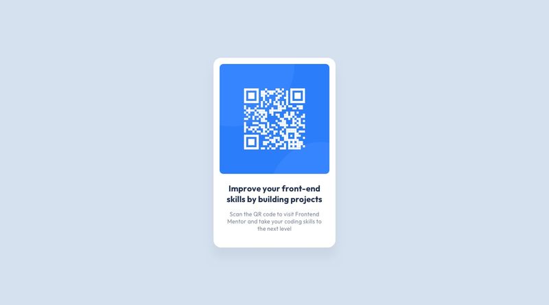
In this specific challenge there are no changes to the design on any screen sizes, so no need for any media query. Hooray!
Nor is a media query needed on simple blog sites, like this Eleventy Base Blog demo.

That's a boring example I know, but the important thing is it WORKS! It is functionally sound and has a simple design focused on content. We don't need to complicate the build with unnecessary media queries.
Even sites like Andy Bell's personal site or his super interesting Set Studio site design don't have many media queries at all!

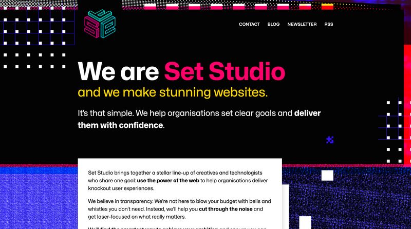
A lovely media-query free example
If you've never watched Andy's excellent talk "Be the browser’s mentor, not its micromanager" and had a look at the accompanying website Build Excellent Websites bookmark those links right now and be sure to watch after reading this post.

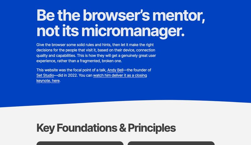
This talk and demo site is absolute gold. You don't need to master all of the techniques he covers straight away, I'm simply sharing here to demonstrate what's possible without media queries.
Isn't it beautiful?
Media queries are a good thing
Wait, aren't I contradicting myself now?! Didn't I just show you a load of examples without (or with hardly any) media queries?
Yes. I did. Sorry if that's confused you.
Let me be clear: I am not advocating against media queries or saying you should avoid them. Media queries are not obsolete!
It's GREAT to become aware of all the modern fluid layout techniques at our disposal in modern CSS, try out intrinsic sizing approaches and learn from CSS wizards like Andy Bell, Steph Eckles, and Kevin Powell (or many more!).
Media queries are one of many valuable tools at our disposal, but you need to know how to use them well, and they are not all you need to know when it comes to responsive styling.
How to best approach responsive styling
As a more general answer to your questions around when and how to add breakpoints:
- Do all html before anything. Make sure the right meaningful elements are chosen for the content
- Style the mobile design first. Shrink your viewport down, zoom and/or use device emulation view. I like to keep devtools open on the side of my screen to make this easier.
- For FrontEnd mentor challenges — where the mobile static design that's provided is 375px wide — get everything looking right at that width first.
Then shrink the viewport width to 320px wide and check there's still no horizontal (inline) overflow and everything works.
A top tip is to prefer max-width over width for your components! Also try to avoid fixed units when using flex or grid layouts, opting for % or fr units instead. - Only once you are happy with the mobile view should you start to enlarge the viewport. Depending on design, and what layout changes are needed, add a breakpoint (min-width media query) at the point where there is room for the layout to change. Make sure you note down the media query essentials below!
Media query essentials
- Media queries should be written in rem/em, not px
- Prefer min-width media queries, so you work mobile first
- You will rarely if ever need to set min and max bounds on a media query. Min-width media queries say "from this size and up, change these properties" - That should be all you ever need.
- Tables are the one exception where I'd lean towards making the desktop design the default styles. That's because data tables are generally designed to work on larger screens and their default styles will often work well on desktop. You'll need a lot more overrides for mobile in this case, so it makes sense to switch tactic and use a max-width media query there. Kevin Powell has a good video teaching how to build a responsive table, if that interests you.
- Media query breakpoints would be set up as variables at the start of a project on a real site, so you would select the one closest for your needs: e.g. "medium", which may have already been set up to equate to 48rem. On personal projects, or FrontEnd Mentor challenges though, you can set up your media queries to be at whatever point you need them to be. You can still set them up as variables if you want, but only add media queries when the layout needs to change because there is enough space to do so.